
In this article
Explore the key concepts, practical considerations, and frequently asked questions related to 15 rcs campaign examples that drive real results (2026).
Key takeaways
- Cart abandonment cards that show the exact product image, price, and stock-urgency line consistently outperform a plain-text SMS reminder for e-commerce.
- Across the 15 examples, RCS campaigns showing real, specific content- an actual amount due or appointment time- beat generic promotional copy every time.
- Turning a fintech fraud alert into a one-tap 'Yes, this was me' or 'No, block my card' decision cut response time versus an IVR callback menu.
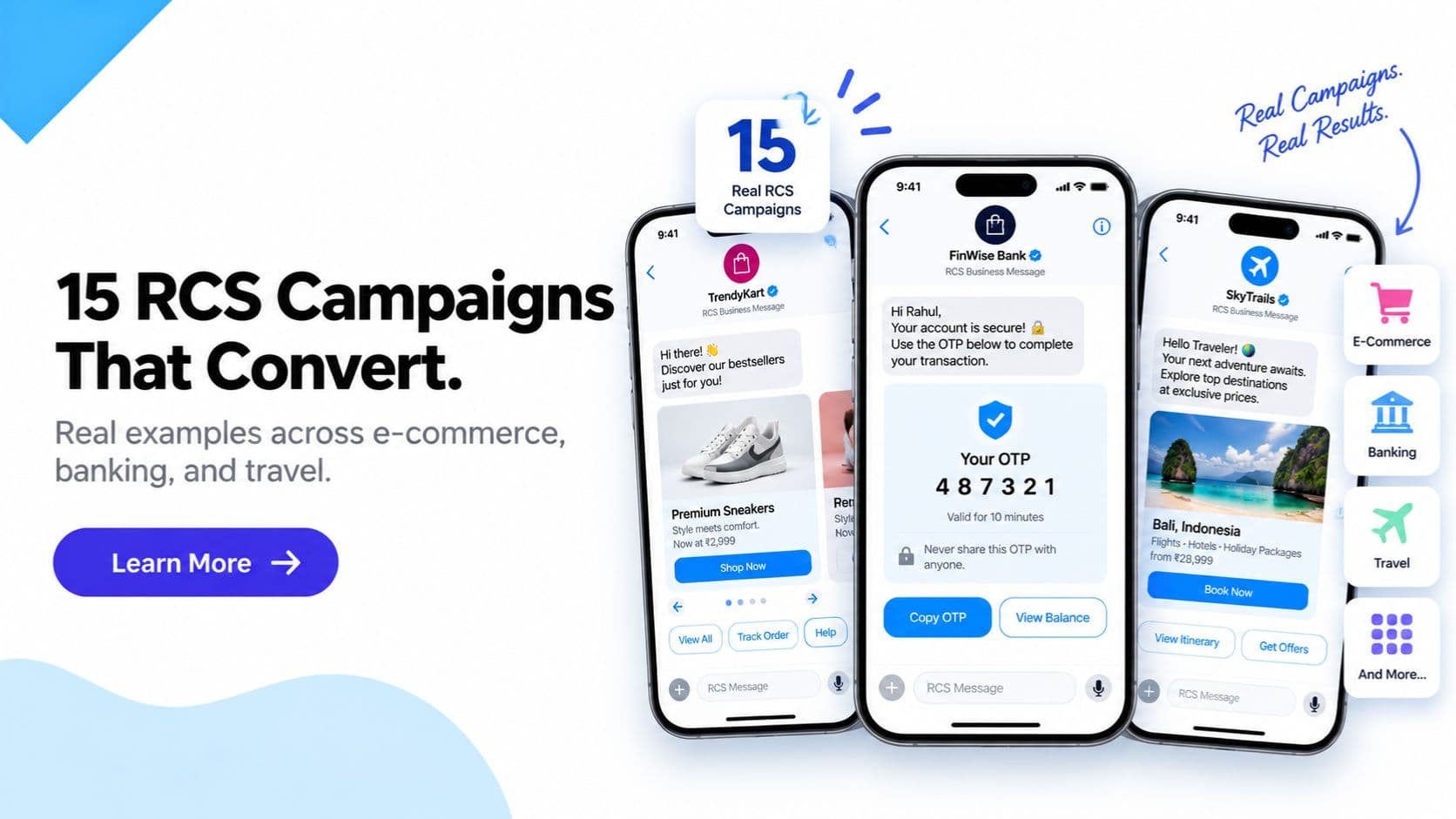
If you have read about what RCS messaging is and want to see what it actually looks like in a real campaign, this guide is for you. Rather than explaining the theory again, we are walking through 15 realistic RCS campaign setups across the industries that use the channel most- with the rich card structure, the button choices, and why each one works.
Quick answer: The best RCS campaigns combine a verified sender badge, one strong product or offer image, a short benefit-led headline, and one clear action button- Buy Now, Track Order, Pay Now, or Book Now. Across e-commerce, banking, travel, and real estate, campaigns that show the actual product, price, or status inside the card consistently outperform plain text SMS by 3x to 7x on click-through rate.
Every example below reflects the kind of rich card or carousel setup available through RCS business messaging today on Jio, Airtel, and Vi in India, with automatic SMS fallback for devices that do not yet support RCS.
Why RCS Campaigns Outperform Plain Text
Before the examples, it helps to understand the mechanism. A plain SMS asks the customer to imagine the product, trust an unfamiliar sender ID, and manually open a link. An RCS rich card removes all three friction points at once- it shows the product, proves the sender is genuine with a verified badge, and puts the action one tap away.
This is not a marginal improvement. Businesses running RCS vs SMS side by side on the same audience consistently see RCS click-through rates several times higher than SMS. The 15 examples below show exactly where that gap comes from in practice.
1. E-commerce: Cart Abandonment Recovery
Setup: Rich card with the exact product image the customer viewed, price, a stock-urgency line ("Only 4 left"), and a "Complete Purchase" button linking straight to checkout.
What made it work: The card recreates the product page inside the message. The customer does not need to search for the item again- one tap returns them exactly where they left off, which removes the single biggest reason abandoned carts never convert.
2. E-commerce: New Arrival Carousel
Setup: A 5-card carousel showing new arrivals in a category the customer has previously browsed, each card with image, price, and a "View" button, plus a final card linking to the full collection.
What made it work: Personalising the carousel to past browsing behaviour rather than sending a generic "new in store" message meant every card was relevant, so scroll-through and click rates stayed high across all five cards instead of dropping off after the first.
3. Banking: Verified Payment Due Reminder
Setup: A rich card from the bank's verified RCS sender with the outstanding amount, due date, and a "Pay Now" button that opens a secure payment link, plus a "Call Support" quick-reply button.
What made it work: The verified sender badge matters enormously here. Payment reminders are a common phishing vector in India, so a message that visibly comes from the bank's confirmed identity- not a spoofable alphanumeric header- gets acted on with far more confidence. See our RCS verified sender guide for how this verification process works.
4. Fintech: Fraud Alert with One-Tap Confirmation
Setup: A rich card flagging an unusual transaction, with two quick-reply buttons- "Yes, this was me" and "No, block my card"- and a support number as a fallback.
What made it work: Turning a fraud alert from a "call this number" instruction into a one-tap decision cut response time significantly. Customers resolved the alert in seconds instead of navigating an IVR menu, and the fintech saw faster fraud containment as a direct result.
5. Travel: Flight Booking Confirmation
Setup: A rich card with the airline logo, route, date, and PNR, plus buttons for "Web Check-in," "View E-Ticket," and "Manage Booking."
What made it work: Consolidating three separate post-booking actions into one message meant customers stopped needing to dig through email for the same information. Web check-in completion rates rose because the button appeared automatically at the right time, not buried in an inbox.
6. Travel: Flight Delay Carousel Update
Setup: A sequential 3-card update- first card shows the delay notice, second shows the revised time and gate, third offers rebooking or lounge access options with a button.
What made it work: Breaking a stressful update into digestible cards rather than one dense paragraph reduced confusion, and read receipts let the airline's ops team confirm which passengers had actually seen the update before making gate decisions.
7. Real Estate: New Project Launch
Setup: A carousel of 4 to 6 cards showing exterior renders, floor plan thumbnails, starting price, and a "Book Site Visit" button on the final card.
What made it work: Real estate decisions are highly visual and high-consideration. Letting a prospect browse renders and floor plans inside the message- before ever visiting a website- pre-qualified leads, so site visit bookings came from genuinely interested prospects rather than casual clickers.
8. Real Estate: Site Visit Reminder
Setup: A rich card with a map thumbnail of the property location, the appointment time, agent name and photo, and "Get Directions" and "Reschedule" buttons.
What made it work: Attaching a map directly to the reminder eliminated the "where exactly is this" back-and-forth call that agents were fielding constantly, and no-show rates dropped once directions were one tap away.
9. Food Delivery: Order Confirmation and Live Tracking
Setup: A rich card with the restaurant name, order summary, estimated delivery time, and a "Track Order" button linking to a live map.
What made it work: Replacing a generic "your order is confirmed" SMS with a card that visually confirms exactly what was ordered reduced support tickets from customers unsure if their order went through correctly.
10. Food Delivery: Re-order Prompt Carousel
Setup: A carousel of the customer's 3 most-ordered dishes from their favourite restaurant, each with a "Reorder" button that adds the item straight to cart.
What made it work: Removing the entire browse-and-select step for a repeat customer turned a multi-minute decision into a single tap, which is why re-order campaigns like this typically post some of the highest conversion rates of any RCS use case.
11. D2C Brand: Limited-Time Offer Card
Setup: A single rich card with a bold offer image, discount percentage, countdown-style urgency line, and a "Shop the Sale" button.
What made it work: A clean, single-image card with one clear offer and one clear button outperformed a busier multi-card version in A/B testing- for flash sales, simplicity and urgency beat variety.
12. D2C Brand: Post-Purchase Review Request
Setup: A rich card showing the product the customer bought, a friendly thank-you line, and a "Rate Your Purchase" quick-reply button offering a 1-5 star tap response.
What made it work: Letting customers rate directly inside the message, instead of redirecting to an external review form, meant far more customers completed the action- friction removal again being the deciding factor.
13. Insurance: Policy Renewal Reminder
Setup: A rich card with the policy type, expiry date, renewal premium, and "Renew Now" and "Talk to Advisor" buttons.
What made it work: Presenting the renewal amount clearly upfront, backed by a verified insurer badge, reduced the hesitation customers usually feel opening an unfamiliar SMS link to pay a renewal premium.
14. Ed-tech: Course Enrollment Follow-up Carousel
Setup: A carousel showing the course the visitor viewed, a related bundle offer, and a testimonial card, each with an "Enroll Now" button.
What made it work: Sequencing product, offer, and social proof across three cards mirrored a mini landing page inside the chat thread, giving hesitant prospects the reassurance they needed without leaving the messaging app.
15. Healthcare: Appointment Reminder with Prep Instructions
Setup: A rich card with the doctor's name and photo, appointment time, clinic location map, and a "Confirm" quick-reply plus a "View Prep Instructions" button for tests requiring fasting or documents.
What made it work: Bundling logistics (location, time) with practical prep guidance in one trusted message reduced both no-shows and appointments where patients arrived unprepared for a test.
Common Threads Across High-Performing RCS Campaigns
Looking across all 15 examples, a few patterns repeat consistently:
- One primary action per card. The strongest cards ask the customer to do exactly one thing- pay, track, book, reorder- not several competing things.
- Real, specific content beats generic content. Showing the actual product, the actual amount due, or the actual appointment time outperforms generic promotional copy every time.
- Verified sender identity carries weight in trust-sensitive categories. Banking, fintech, and insurance examples above all lean on the verified badge as a core part of why the message gets acted on, not ignored as spam.
- Carousels work best when personalised, not generic. A carousel of relevant, targeted items consistently outperforms a carousel of the same content sent to everyone.
If you want ready-to-adapt copy and structure for building cards like these yourself, see our RCS message templates guide, which breaks down the exact headline, subtitle, and button format for each template type. And if you want to know what kind of open rate, CTR, and conversion numbers to expect once your campaign is live, our RCS engagement benchmarks report has industry-by-industry data.
Building These Campaigns on RCS Business Messaging
Every example above is achievable with standard RCS business messaging features- rich cards, carousels, quick replies, and suggested actions are all part of the core RCS specification supported by Google Messages. None of this requires custom app development or a separate download for your customers.
To launch a campaign like the ones above, a business typically needs three things: a verified RCS sender profile, campaign creative built as a rich card or carousel, and a delivery platform that can route messages to RCS-capable devices with SMS fallback for the rest. If you are also weighing RCS against WhatsApp Business API for similar campaign formats, the key difference is reach- RCS does not require the customer to have a separate app installed or to have explicitly opted in through that app, since it reaches customers directly inside their native messaging app.
For businesses evaluating cost before committing to a full campaign calendar, see our breakdown of RCS messaging cost in India, and for the technical side of connecting your systems, our RCS API integration guide covers the setup process end to end.
Get Click Media is one of India's leading RCS messaging service providers, helping e-commerce, BFSI, travel, real estate, and D2C brands design and launch rich card and carousel campaigns like the examples above- with verified sender setup, carrier connectivity across Jio, Airtel, and Vi, and automatic SMS fallback built in. Request a demo to see your own campaign built as a rich card.
Article topics
Frequently Asked Questions
What is an example of an RCS campaign?
A typical RCS campaign example is an e-commerce cart abandonment message that shows the exact product image the customer left behind, its price, a short urgency line like 'only 3 left in stock', and a 'Complete Purchase' button that opens the checkout page directly. This single rich card recreates the shopping context inside the message itself, which is why it consistently outperforms a plain text SMS reminder.
Which industries get the best results from RCS campaigns?
E-commerce, banking and fintech, travel, real estate, and food delivery see the strongest results from RCS campaigns in India, because these industries rely heavily on visuals, verified trust, and quick-tap actions like Buy Now, Pay Now, or Track Order. Any business where a picture, a map, or a button meaningfully speeds up a decision is a strong fit for RCS.
How many products can I show in one RCS carousel?
Google's RCS Business Messaging standard supports carousels of up to 10 rich cards in a single message, each with its own image, headline, description, and buttons. Most high-performing campaigns use 4 to 6 cards, since customers scroll through fewer cards more thoroughly than they scroll through a full set of 10.
What makes an RCS campaign convert better than SMS or email?
RCS campaigns convert better because they combine three things no other channel offers together in one message: a verified sender badge that builds instant trust, rich visual media that shows the actual product or offer, and tap-to-act buttons that remove the need to copy a link, dial a number, or open an app. Removing friction at every step of the decision is what drives the higher click-through and conversion rates seen across RCS campaigns.
Do RCS campaign examples work the same way on iPhone and Android in India?
Yes, largely. RCS rich cards, carousels, and buttons render consistently on Android devices using Google Messages and on iPhones running iOS 18 and above, across Jio, Airtel, and Vi networks. Minor rendering differences can exist between apps, so it is good practice to preview a campaign on both platforms before a large send.
Can I reuse the same RCS campaign template across different industries?
The underlying rich card structure- image, headline, subtitle, body text, and buttons- is reusable across industries, but the content strategy should not be copied directly. A cart abandonment card for e-commerce and a bill-due card for banking use the same technical format but need very different tone, urgency, and calls to action to convert well.
How do I get started running RCS campaigns like these examples?
To run RCS campaigns like the examples in this guide, a business needs a Google-verified RCS sender profile, campaign creative built as rich cards or carousels, and a messaging platform that can send RCS with automatic SMS fallback for unsupported devices. Get Click Media handles verification, delivery, and fallback as part of a single RCS messaging setup.
What is the difference between a rich card and a carousel in RCS?
A rich card is a single RCS message unit containing one image or video, a headline, description text, and up to two or three buttons. A carousel is a horizontally scrollable sequence of multiple rich cards sent as one message, used to show several products, offers, or options side by side in a single conversation thread.
About the author
Get Click Media creates practical resources for businesses using messaging, automation, analytics, and digital communication to improve customer engagement. This article was published on .